Clarifi
Project Overview
Designing a desktop plug-in that helps teenagers with ADHD get work done efficiently.
Client Overview
Clarifi is a startup with a mission to amplify ADHD students’ gifts by providing them with the right toolkit to bring their creativity and focus to life.
Methods
User Interviews
Wireframing
Style Guide
Usability Testing Prototyping
Figma
My Role
UI/UX Designer
-- Collaborated with 2 student designers, Clarifi’s engineering team, and Clarifi’s CEO/founder.
🔍
01. The Opportunity
Users struggle with completing their homework in a motivated and timely manner.
❤️
02. Empathize
Chatting with Clarifi’s CEO and our target audience
Our design team began by having a discussion with our client to find out more about the nature of the product and what the mission/values of the company were.
He wanted a product that:

Competitor Analysis
I was curious what other productivity-esque apps already exist in this space. I noticed that while there are many that either aid in notetaking, organization, and productivity, there are none that are none specifically tailored for students with ADHD.
![]()

User Interviews
A personal challenge for me while on this project was understanding how to design for a demographic I was not familiar designing for. In order to gain a better understanding of how students with ADHD approach work, we interviewed 5 middle school students with ADHD on their experience with digital homework and academic habits.
![]()

Pain Points
From our findings, we found 3 major pain points:
Our target audience...
1) Experiences little motivation to complete their homework efficiently.
2) assignments tedious and dull.
3) Do not have structured study plans to guide their study time.
Our target audience...
1) Experiences little motivation to complete their homework efficiently.
2) assignments tedious and dull.
3) Do not have structured study plans to guide their study time.
👇
03. Define
Who are we trying to solve this problem for?
User Persona: Meet Justin
After analyzing our interview responses, we had to let Justin’s persona guide our decision making. We brainstormed specific solutions to directly target each of the main pain points we carved out earlier:


🧠
04. Ideate & Prototype
My team sat together and had a fun, productive brainstorming session! We reminisced about our middle school days and tried to consider what visuals would appeal to middle schoolers.
Moodboard

- Pixel art
- Minecraft-like aesthetic
- Adventure graphics
- Mini window format (similar to plug-ins like PowerNotes)
- Still very structured and organized (similar to goal-setting apps)
Style Guide

We wanted to make Clarifi fun and exciting.
Drawing inspiration from Minecraft’s strong sense of adventure, we aimed for pixel art aesthetics, a task-oriented storyline, and diverse graphic assets (e.g. characters, tools) all while maintaining coherent structure and visual cleanliness. In regards to colors, low wavelength colors like blue are scientifically proven to help improve efficiency, focus, and creativity, which is why we selected a blue color palette to dictate our designs.
“The student user is a hero on an adventure to study!”
Wireframe Sketches

Mid-Fi Wireframes and Desired Features

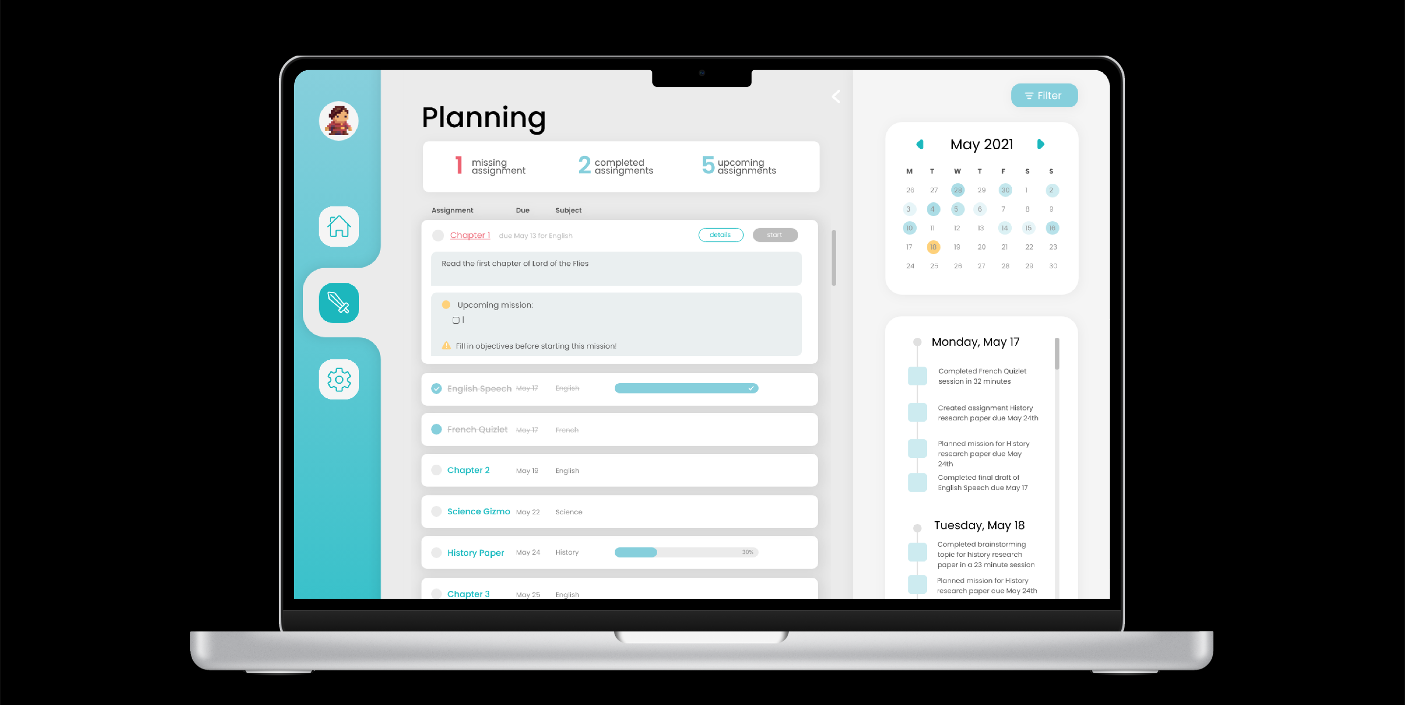
Feature 1: Point System
Every time the user completes a logged assignment, the XP (experience points) bar will increase incrementally depending on the task’s level of difficulty. This feature serves to incentivize users to complete their assignments and get started on them sooner than later. When users complete a full bar of XP points, they “advance” to the next level and are able to unlock more rewards/prizes.
Feature 2: Character Profile
Earning more XP points also means unlocking more features for their avatars. Users are able to customize their characters on their homework conquests, providing yet another way to gamify the “tedious and dull” digital work process.
Feature 3: Minimize/Expand Window
One feedback that was given from user interviews was that students often find themselves feeling distracted when they are supposed to be focusing on homework, resulting in longer durations required to finish assignments. After creating their task, users have the ability to minimize the plug-in to just show the relevant information such as time, current task name, XP points, etc...
Feature 4: Space For Study Plans
One of the first frames we want to show users is the “Create a Task” page where they can fill in a detailed outline of what they want to achieve during this study time and how they will do that. Research shows that goals have to be created in a detailed and specific manner in order for them to be realistically achieved. With a framework for what they need to do, users will more likely have a better sense of how to study.
First Iteration Prototype
🧪
05. Testing the Solution
After conducting usability testing studies, we analyzed the feedback from our users:

Room for some changes
Based on the feedback, we decided to change the following:
1) Choose a san serif font that was easier to read
2) Keep the avatar/point system, and expand the library of avatars, accessories, clothes, etc...
3) Make the window expandable to create more space
1) Choose a san serif font that was easier to read
2) Keep the avatar/point system, and expand the library of avatars, accessories, clothes, etc...
3) Make the window expandable to create more space
An updated clickable prototype
Check out Clarifi’s website to view our working prototype: (click image on the right)
Check out Clarifi’s website to view our working prototype: (click image on the right)

🙏
06. What happened after?
Our time with Clarifi was up...
Our six week contract came to an end, and we presented and handed off our initial designs to their CEO and engineering team. We hope that they decide to implement some of our ideas in their final product, and we hope they’ll be an opportunity to collaborate again with their team in the near future.