Path@Penn
Project Overview
A case study involving redesigning Path@Penn–students’ main hub for information about academic records, financial aid, classes, and registration.
Company Overview
The University of Pennsylvania
Methods
User Research
User Flows
Wireframing
Figma
Prototyping
Usability Testing
My Role
UI/UX Designer
User Researcher
🔎️
Context
What is at the heart of the problem at hand?
UPenn’s recent launch of Path@Penn was met with disappointment from students who reported difficulties navigating the new dashboard, finding relevant information, and completing tasks related to course registration.
As such, I wanted to re-imagine how Path@Penn’s functionality and design be improved to meet user needs and increase usability.
🥽
Research
3 User Interviews (behavioral + attitudinal)
I interviewed 3 Penn students from different departments and grades to understand more about how each uses Path@Penn and how they feel towards the platform.

“It’s not as efficient or effective...in the sense of maneuvering around it and understanding how the website works.”
Going into these interviews, I had 3 goals in mind that informed how I curated my list of behavioral and attitudinal questions.
Goal #1: To understand how people currently view and interact with Path@Penn.
Goal #2: To identify people’s pain points with the current Path@Penn user experience.
Goal #3: To uncover users’ unmet needs with Path@Penn.

User Insights
After conducting and analyzing the interviews, it was clear that Penn students...
1. Want to access the most useful information easily.
2. Find navigating the website confusing.
3. Don’t like the cluttered UI of Path@Penn.
4. Feel insecure about whether buttons work or not.
1. Want to access the most useful information easily.
2. Find navigating the website confusing.
3. Don’t like the cluttered UI of Path@Penn.
4. Feel insecure about whether buttons work or not.
🤔
Defining the Problem
...and how might we solve them?
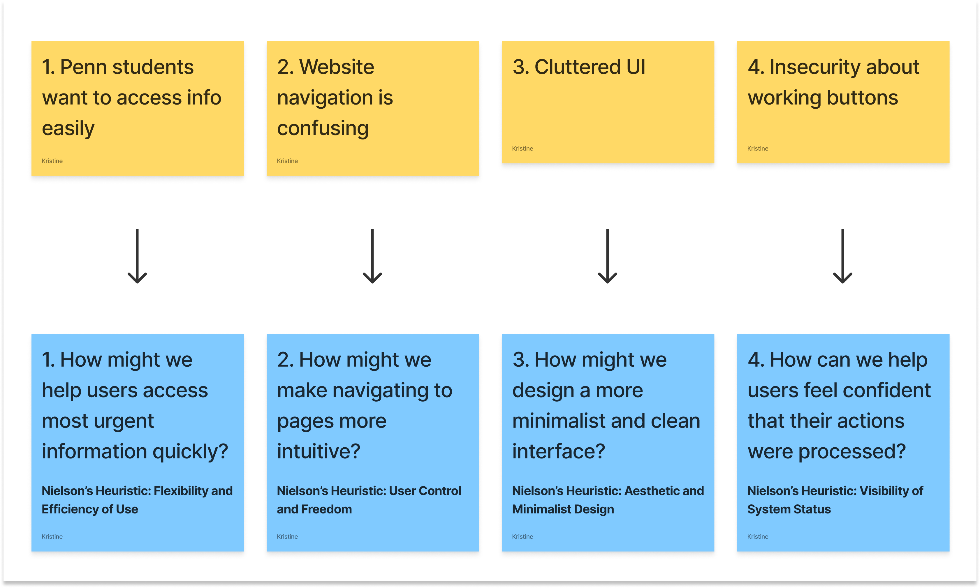
I narrowed down my list of insights into 4 main issues that helped me come up with a list of How Might We statements. Guided by these statements, I decided to tackle the redesign through two of the most common user flows in Path@Penn.
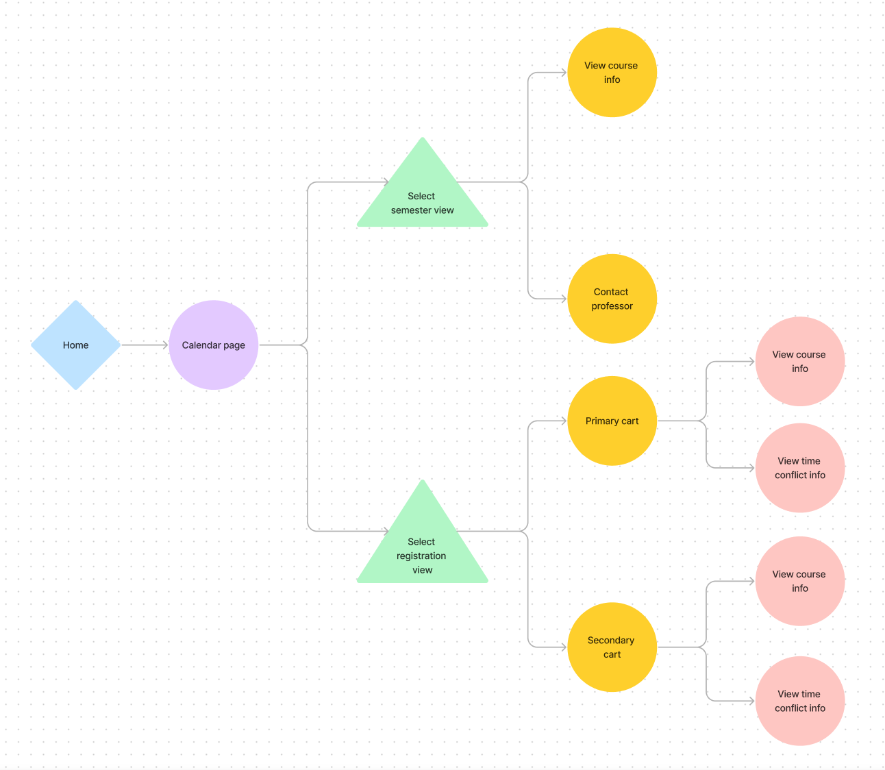
Currently, there is no calendar page on Path@Penn–the two are embedded as users have to go through their course carts to view their schedules, which is extremely inconvenient and tedious. As such, I laid out two new user flows that would separate the registration course carts and the class schedules. Since users voiced in their interviews that they want to access their calendars in both of these main flows, I ultimately decided to focus on one main issue that was broad enough to address this:
How might we help users access their calendars easily when needed?
“It’s annoying that the one thing I use Path@Penn for (viewing my class schedule) is the hardest to find.”
“It’s annoying that the one thing I use Path@Penn for (viewing my class schedule) is the hardest to find.”
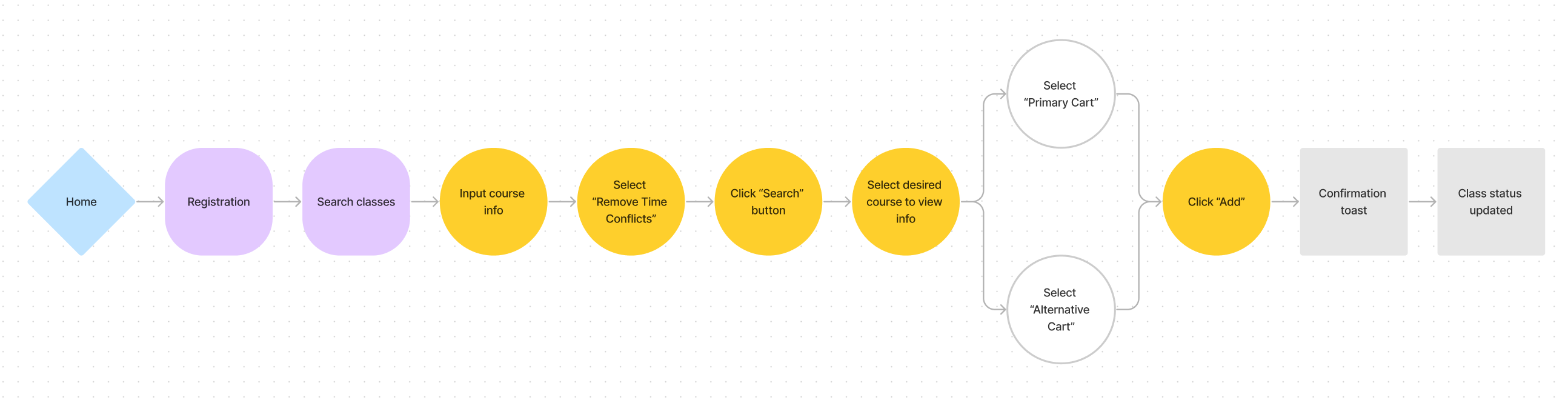
User Flow #1: Add class to cart (course registration)
![]()
User Flow #2: Access class schedule
![]() click image to enlarge
click image to enlarge
click image to enlarge
User Flow #2: Access class schedule
 click image to enlarge
🖋
Solution Exploration
First iterations
Idea #1: Permanent Pop-Up Calendar
I first explored a pop-up calendar view that would live in a fixed button on the bottom right of all pages. Users would be able to click onto the button to view their schedule to either:
1) Check their classes for the day or
2) View how potential classes would fit into their current schedule during registration.
 collapsed calendar view
 expanded calendar view
( Issues) Idea #1: Permanent Pop-Up Calendar
1. Covers the course description/information upon expansion
2. No easy way to access a full calendar view
3. Limited window size makes it hard to fit text in the small calendar blocks
Idea #2: Dashboard w/ navigation menu (left)
Playing around with a couple of different layouts for the full calendar page:
![]()
![]()

🧪
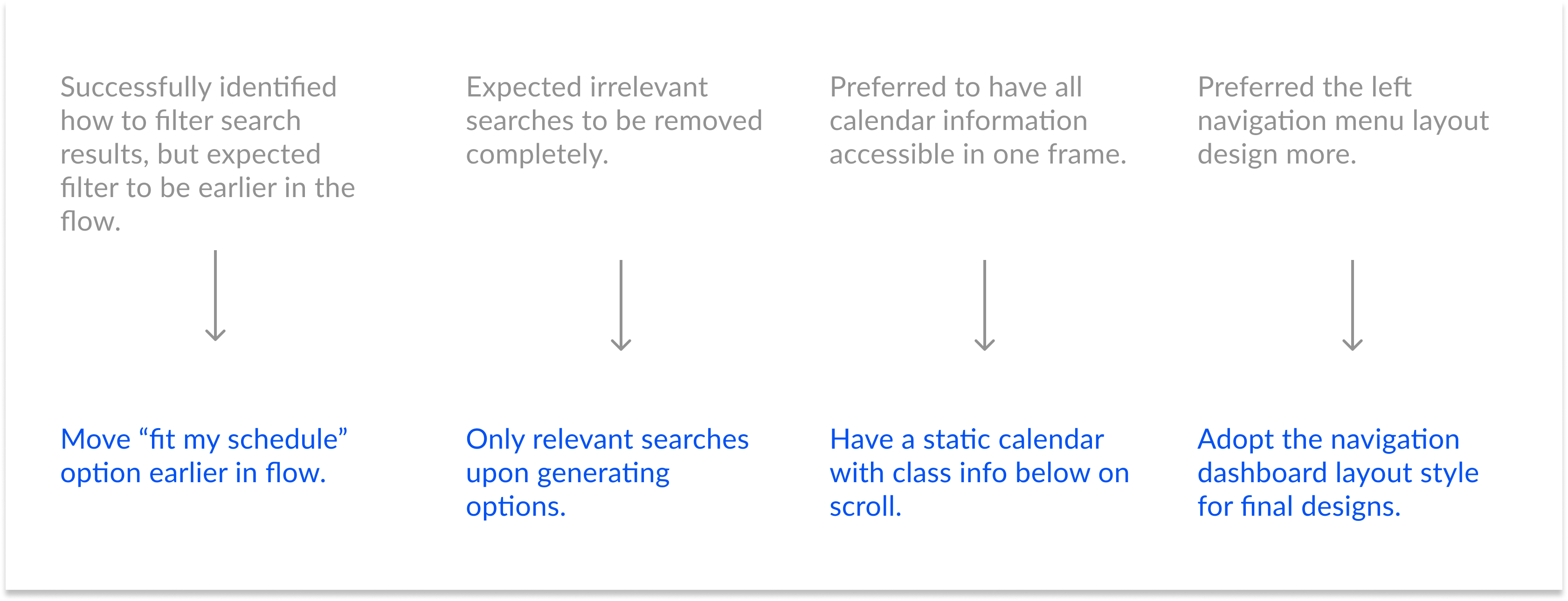
Usability Gut Check
I quickly ran a usability testing study to gauge what parts of my first iterations users were most receptive to and what parts were not user-friendly.
The Results
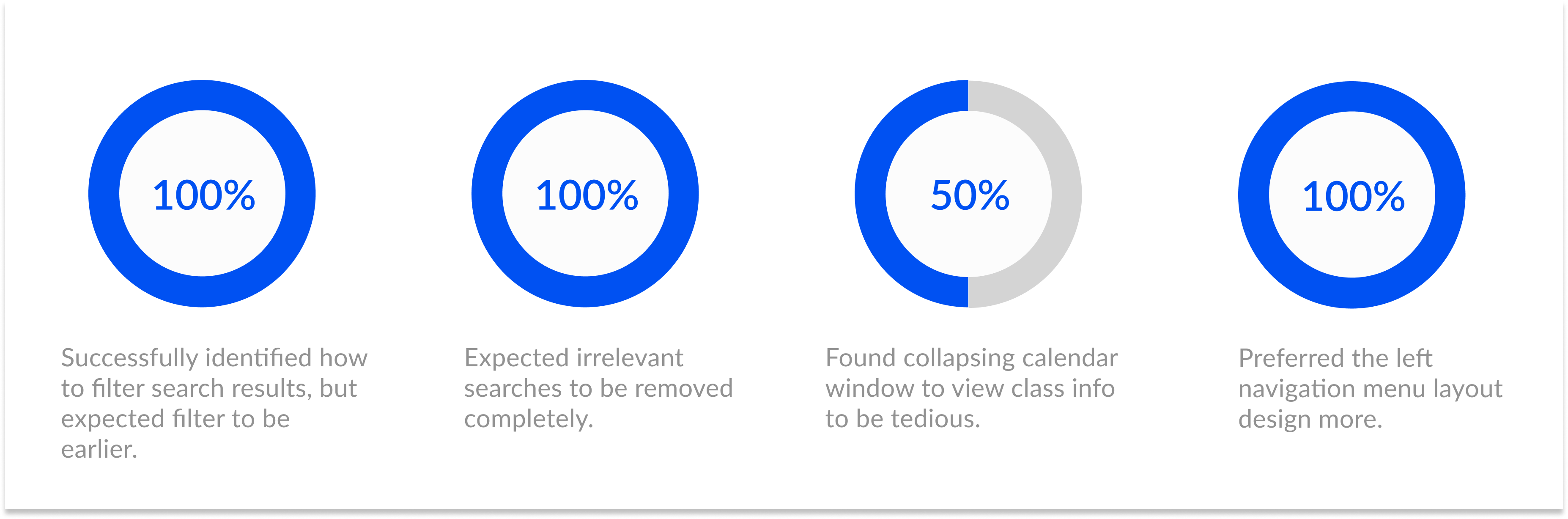
From this feedback, I thought about what changes I should make in my next round of design iterations:
🖋
Design Iterations
Visual Identity:
(The colors are informed by Penn’s website identity guidelines.)

Mid-Fidelity Wireframes
full calendar view
registration: add course to cart
🌟
Final Prototype
See everything in action!
Feature breakdown of main frames
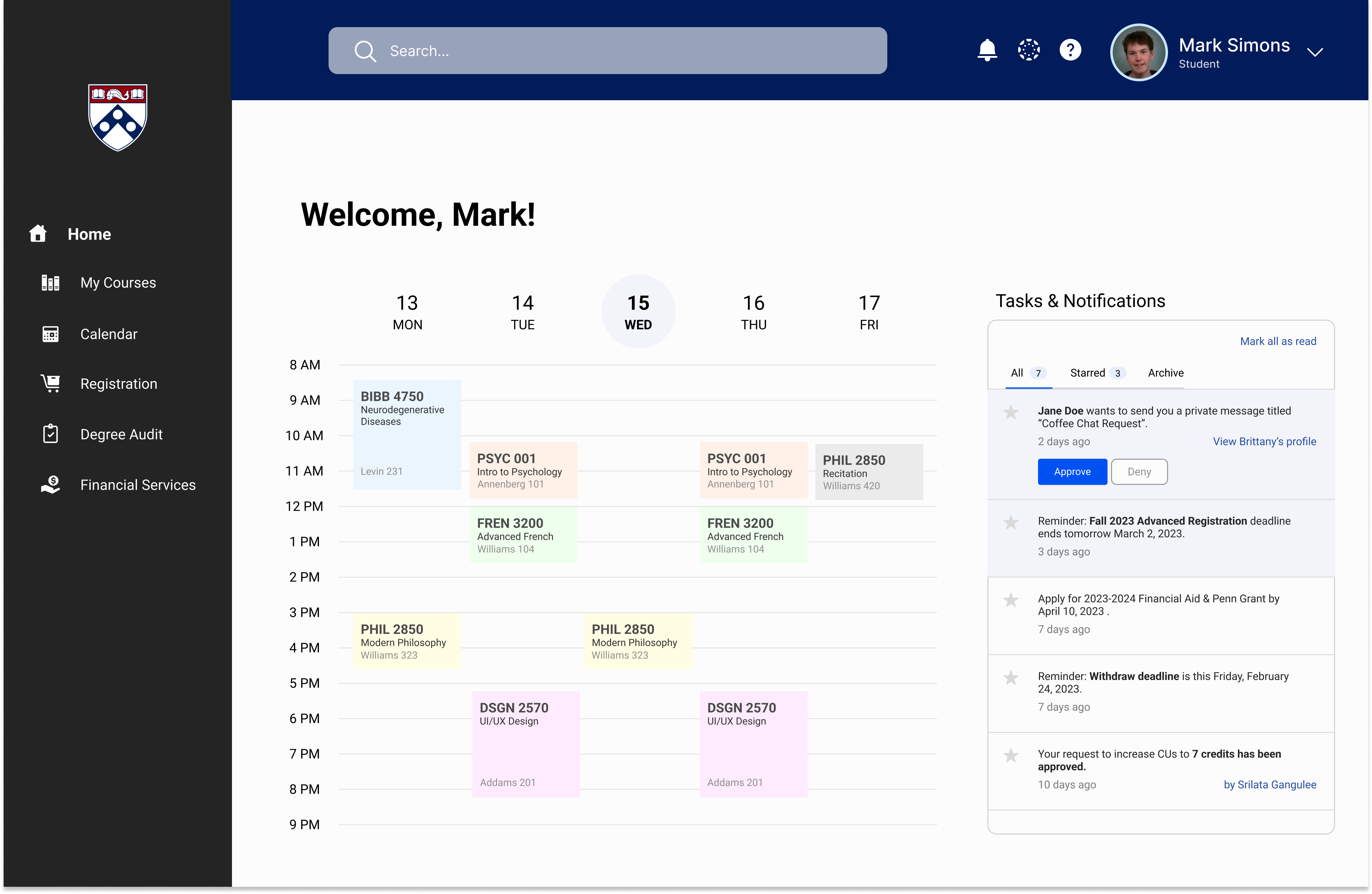
1. Landing Page
I wanted the landing page to showcase and make the most urgent information most accessible (i.e. the functions Penn students use the most). Users can easily 1) view their schedule for the day as well as 2) view important notifications such as any direct messages or important deadline alerts. On the top menu bar, users can search for specific pages, view their Canvas page, get help/support, or view their profiles. On the left, they can navigate between different pages.
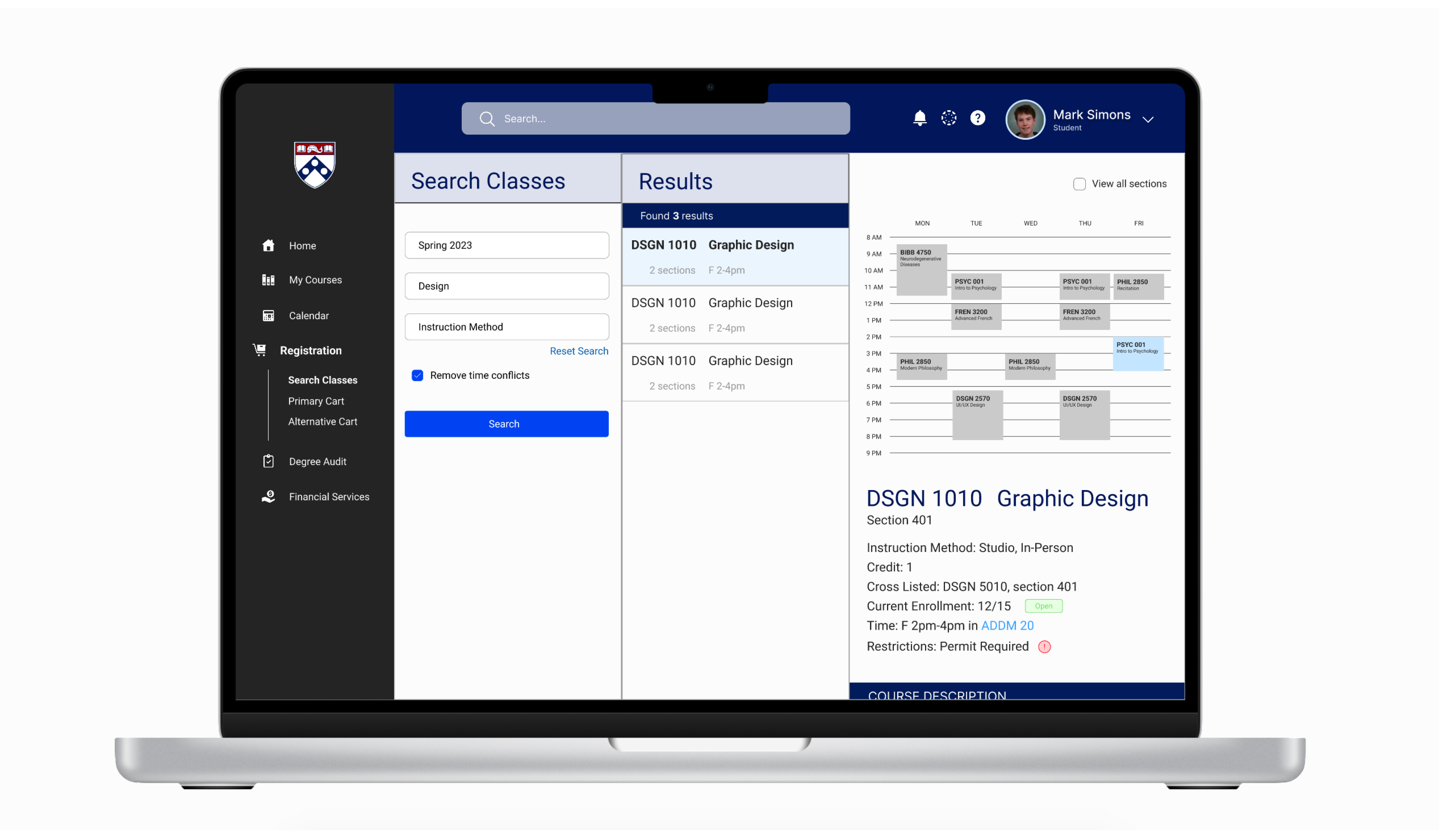
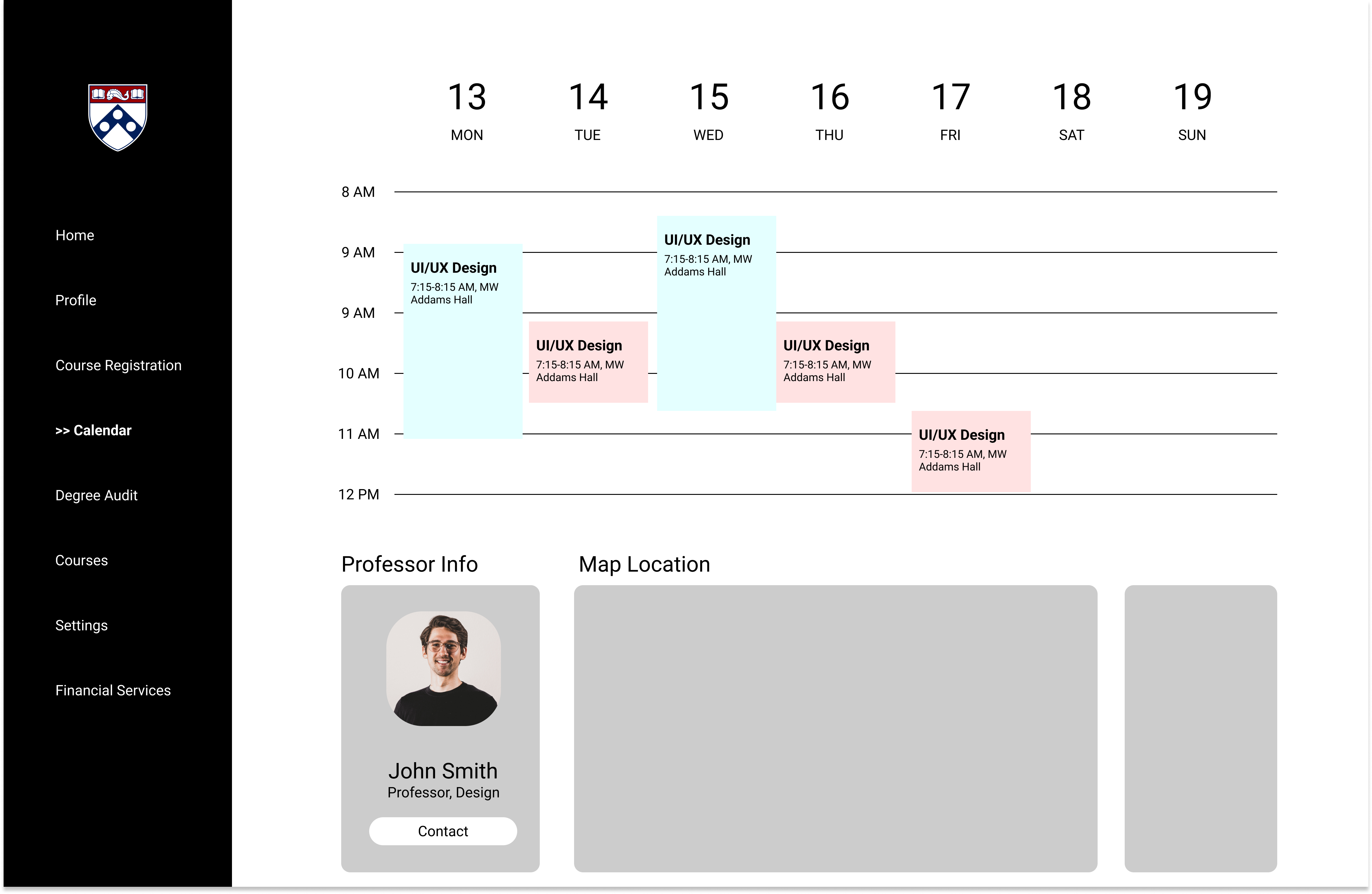
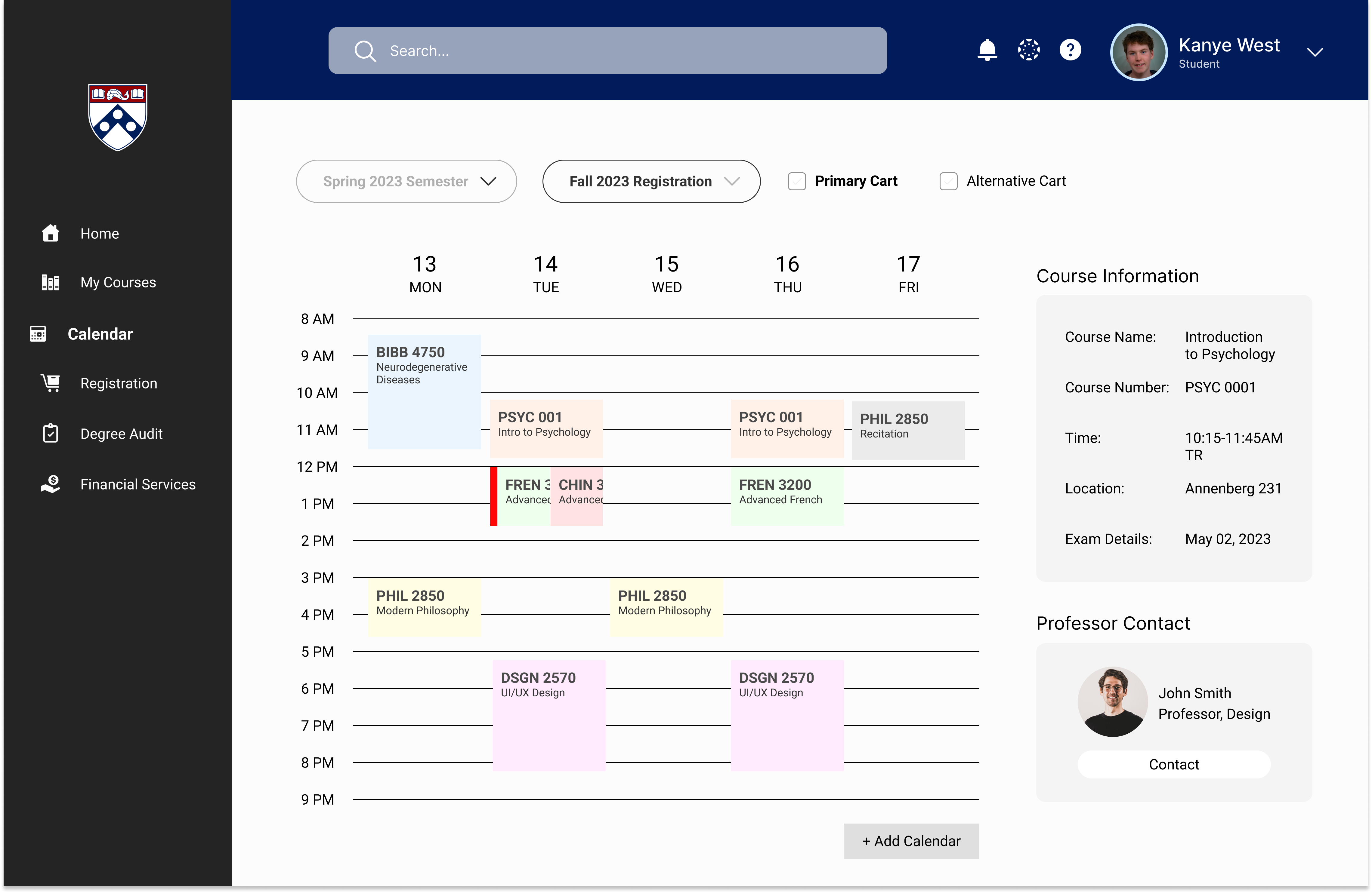
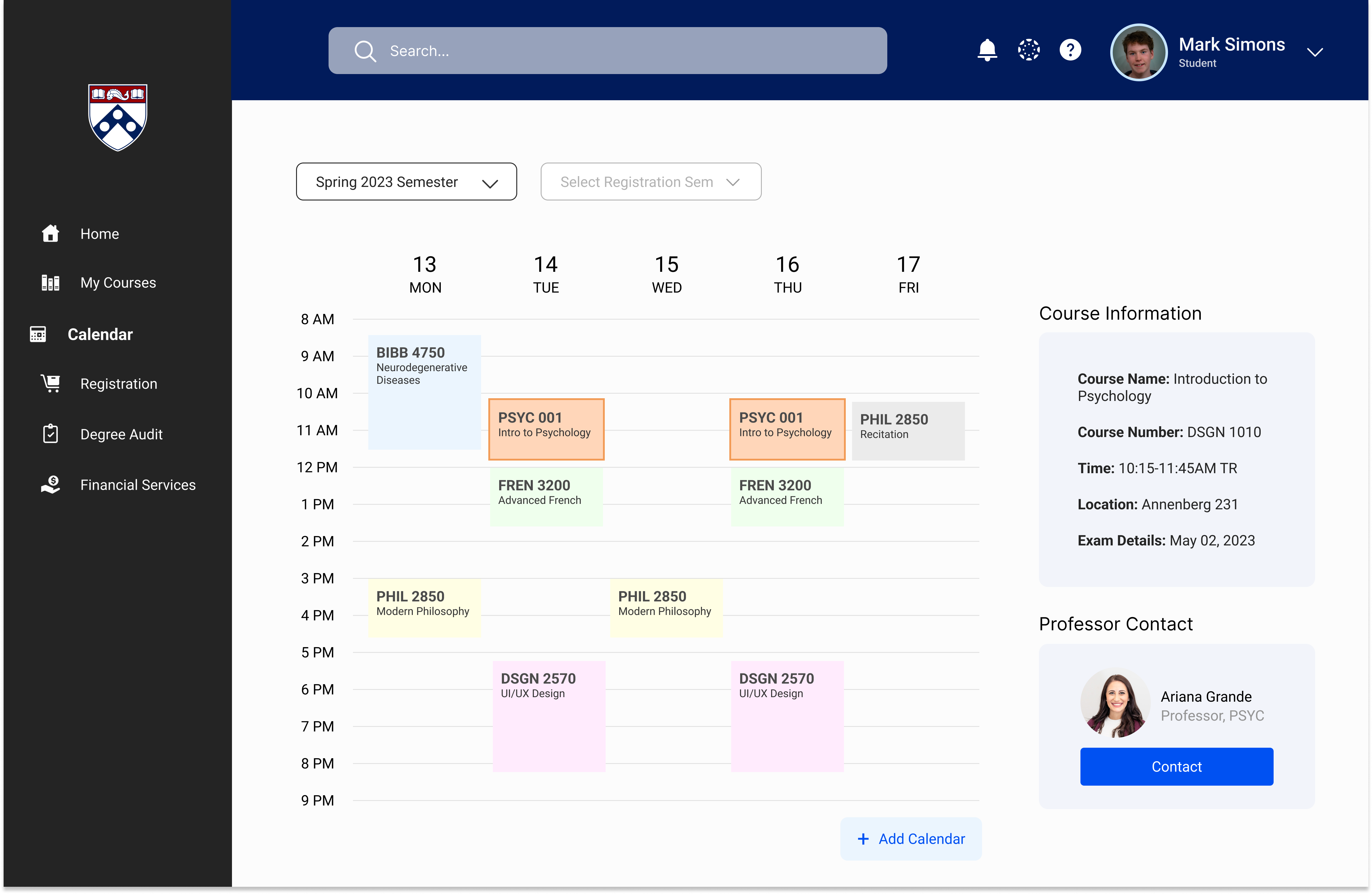
2. Calendar page: semester view – class block selected
On this full calendar page, users can view their schedules in more detail as well as access their working schedules for registration each semester. This frame shows a specific class selected in the schedule and the corresponding information displayed on the right side. Students also have the option to “+ Add Calendar” which imports their Google Calendar to make their schedules more personable and customized.
On this full calendar page, users can view their schedules in more detail as well as access their working schedules for registration each semester. This frame shows a specific class selected in the schedule and the corresponding information displayed on the right side. Students also have the option to “+ Add Calendar” which imports their Google Calendar to make their schedules more personable and customized.
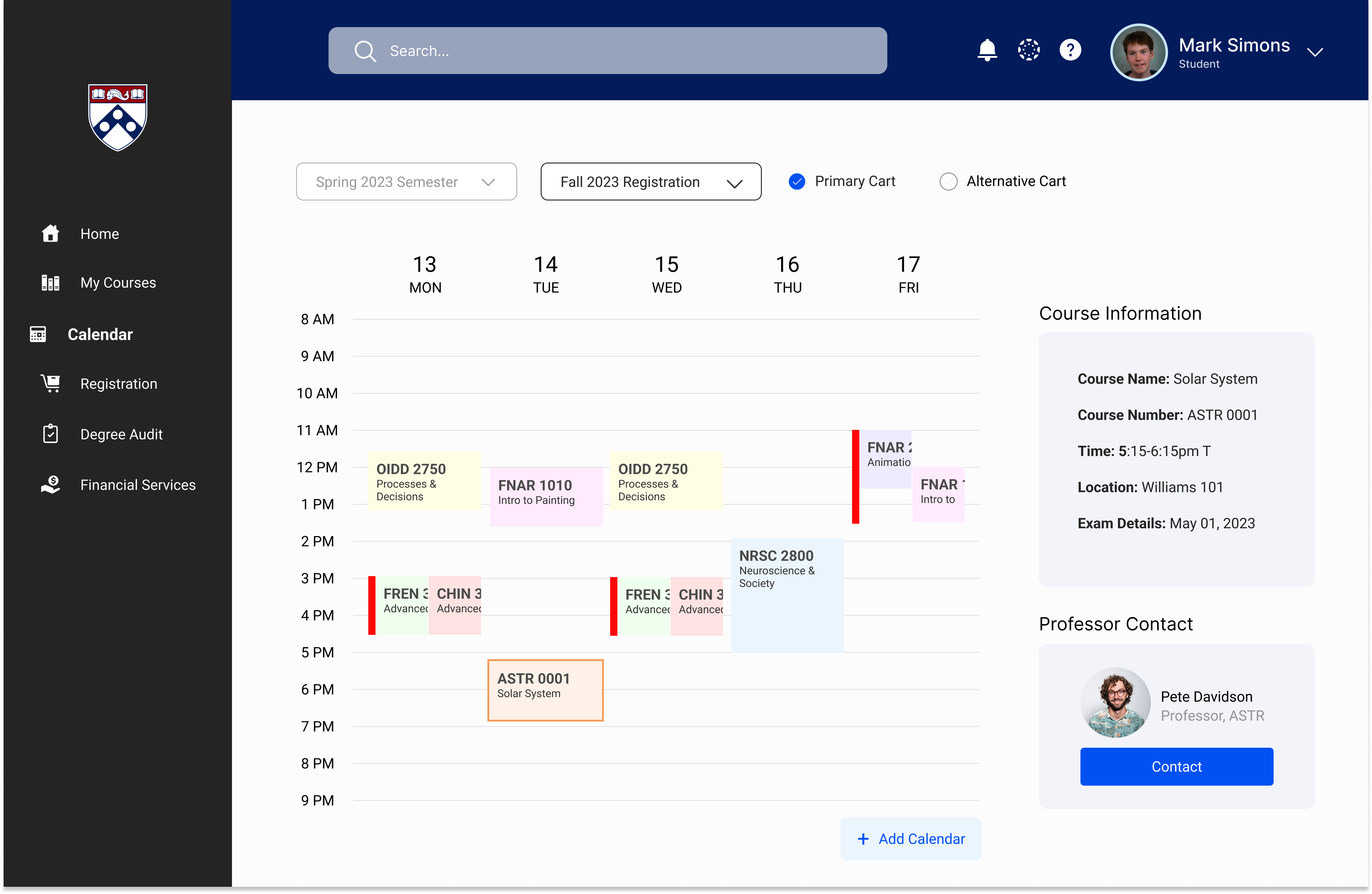
3. Registration cart schedule view: Primary cart
This is the working schedule view for class registration period. Users can view how the classes they have in their “carts” look on a calendar and can view any time conflicts (red bar).
This is the working schedule view for class registration period. Users can view how the classes they have in their “carts” look on a calendar and can view any time conflicts (red bar).
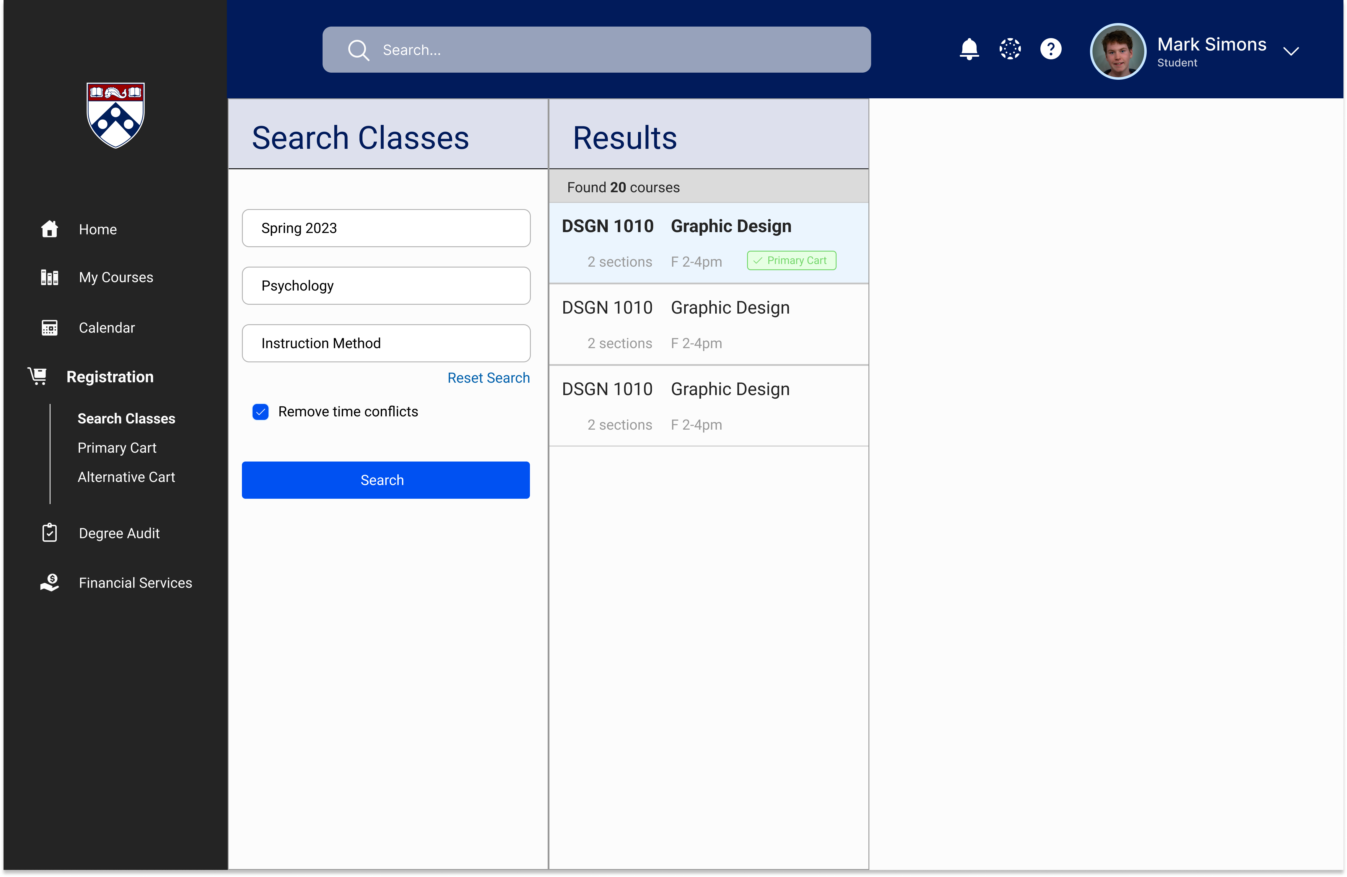
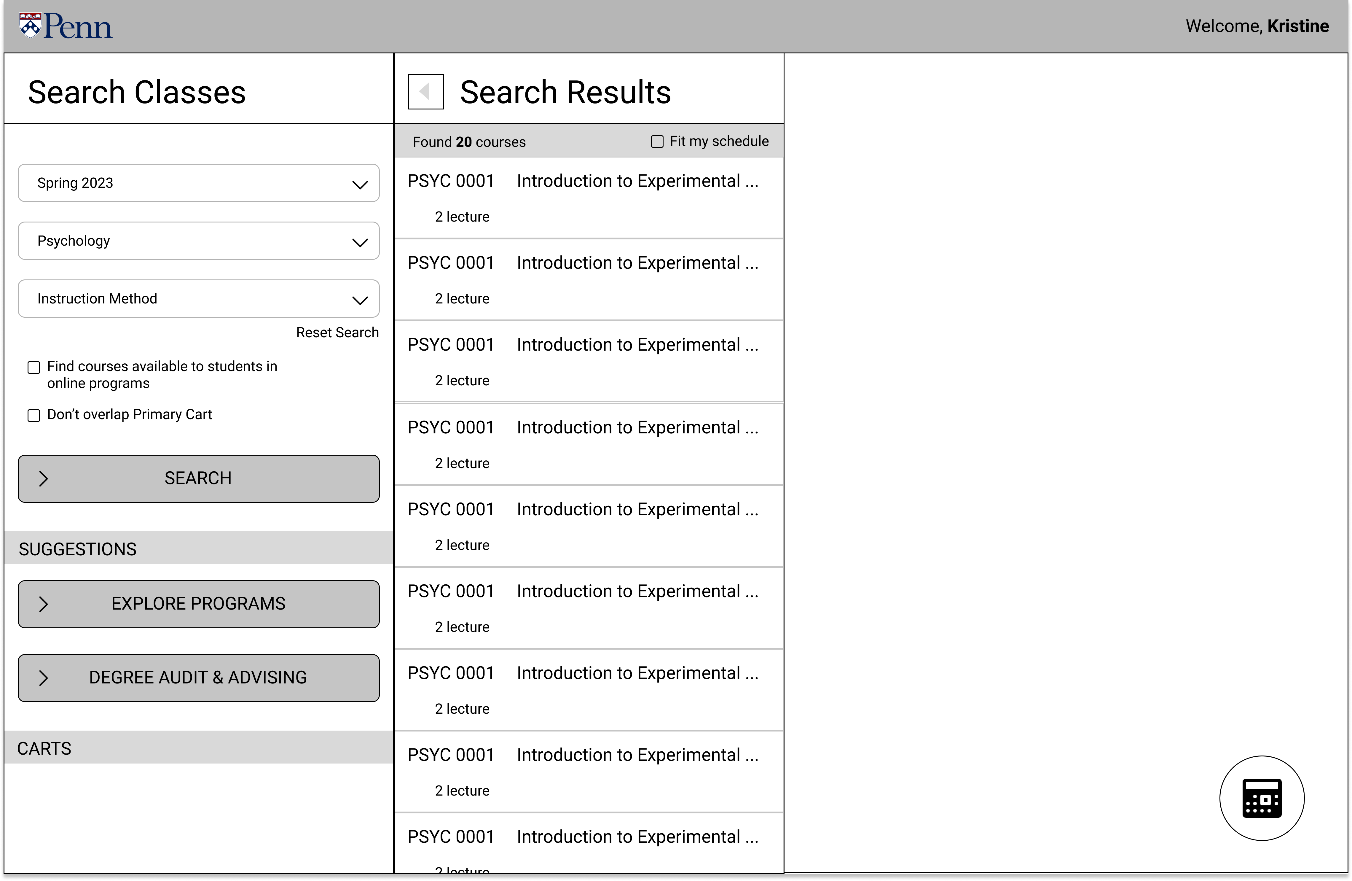
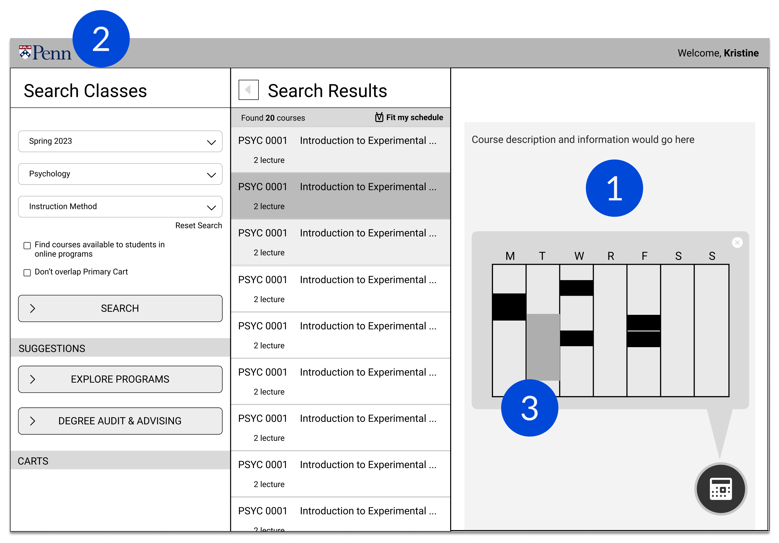
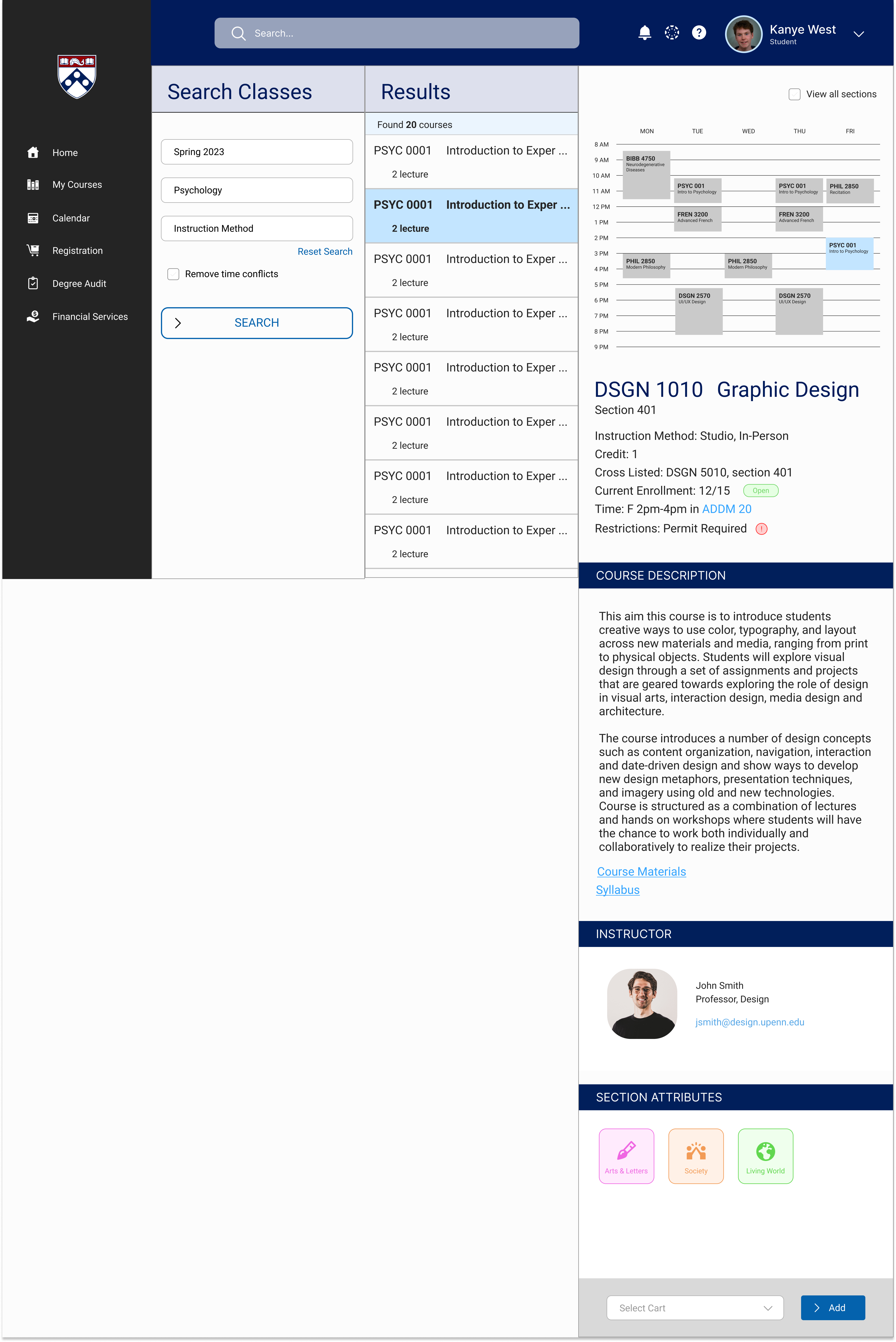
4. Registration (Search Classes page)
This is part of the Registration user flow where users can search and view different classes based on their current working schedules. Right now, Path@Penn does not allow you to filter class searches based on time nor does it display your calendar, making it difficult for users to avoid time conflicts during registration. My re-design allows for users to “Remove time conflicts” as well as visualize where classes would live in their schedules before they choose to add the class of interest into their registration carts.
This is part of the Registration user flow where users can search and view different classes based on their current working schedules. Right now, Path@Penn does not allow you to filter class searches based on time nor does it display your calendar, making it difficult for users to avoid time conflicts during registration. My re-design allows for users to “Remove time conflicts” as well as visualize where classes would live in their schedules before they choose to add the class of interest into their registration carts.

5. Confirmation toast
After users confirm classes match their working schedules for registration and choose to add a specific class to their carts, a confirmation toast will appear.
After users confirm classes match their working schedules for registration and choose to add a specific class to their carts, a confirmation toast will appear.

6. Status updated
After users exit out of the confirmation toast message, they will be able to see that the status of the class they added has been changed accordingly. This additional layer of visual feedback is important for users because many interviewees voiced concern that they are sometimes unsure whether their desired actions gets processed with the original website.
After users exit out of the confirmation toast message, they will be able to see that the status of the class they added has been changed accordingly. This additional layer of visual feedback is important for users because many interviewees voiced concern that they are sometimes unsure whether their desired actions gets processed with the original website.